
cinemagorgeous: Beautiful tribute to Blade Runner by…

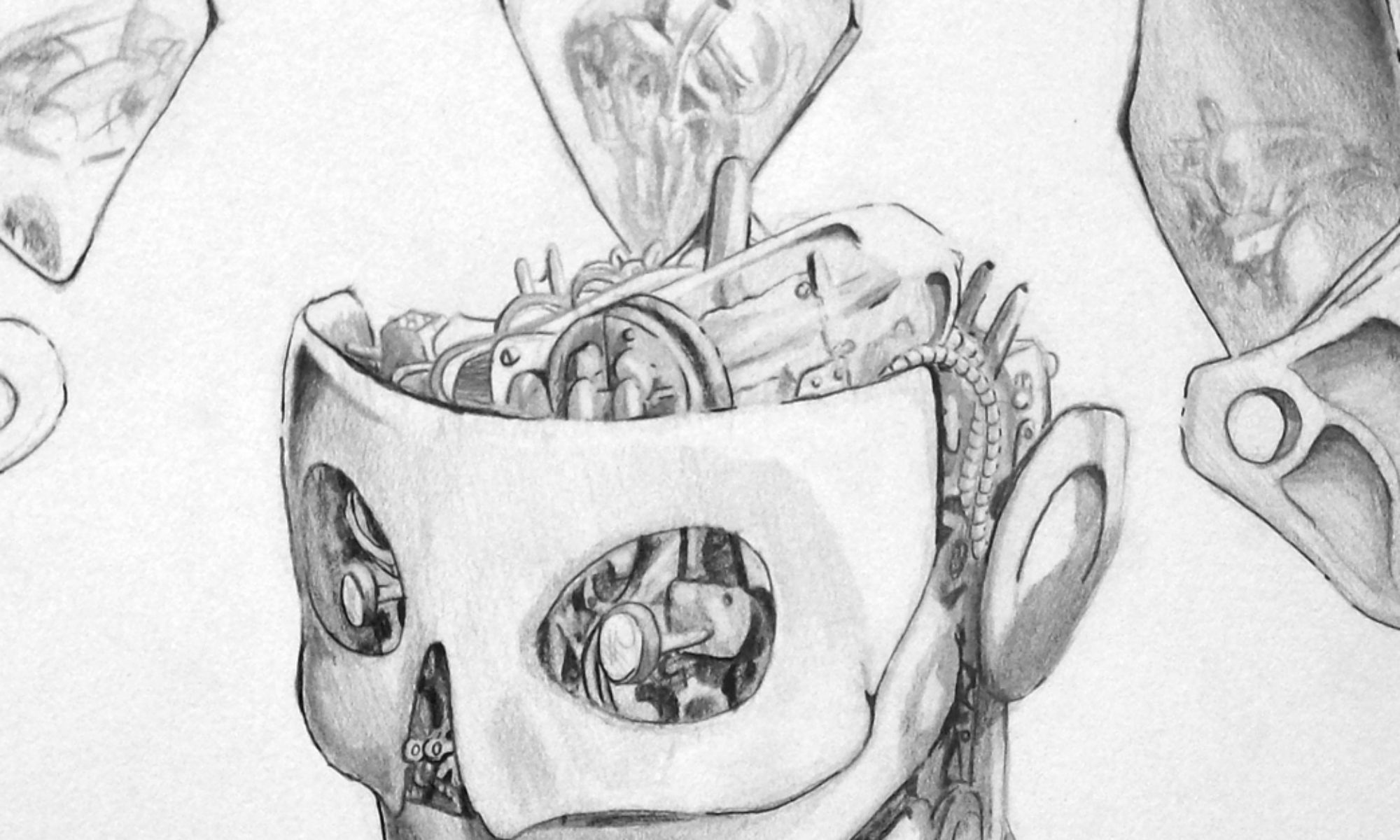
What a Marvelous day it is.

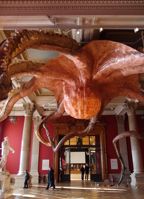
Sculpture by Chinese artist Huang Yong Ping, “Wu Zei”, a 25 meter wide octopus at Monaco’s oceanographic museum.
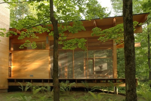
Les Abouts in Québec City
Designed by
Atelier Pierre Thibault the residence is separated in two areas, a common space and a more private zone. The private part stretches to around thirty meters to border the nearby river. Covered by a thin roof, the volume looks as if it is levitating among the trees. Housing the master bedroom, two bathrooms and the kitchen, it was designed to be opened on the surrounding nature and very well-lit. The relationship between the inside and outside is underlined by a fly screen room prolonging the volume and overlooking the ferns.
The common space is a volume on two levels designed to reflect the verticality of the forest. It is also the receptacle of the larger works of art. In order to leave the most possible space on the walls, the guest’s bedroom and the library are suspended in a small volume. Detached from the sides by a glass floor, the volume gains a floating aspect in the double height and brings a variance in the scale of the room. As a wooden chest, the house becomes a recipient where art and nature meet.
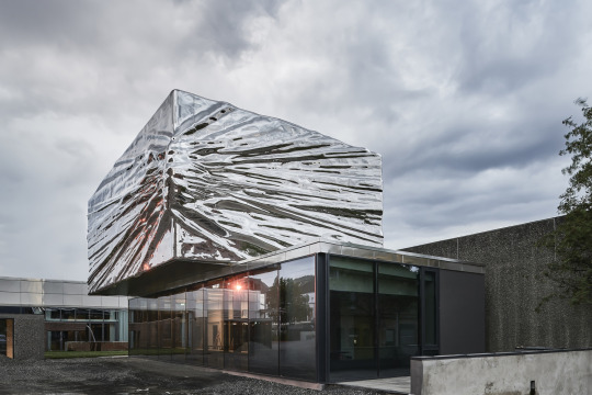
Here are some recent examples of building extensions. Each of them takes a different attitude towards the original structure. Some extensions are obviously meant to be new and different, some are hidden or camouflaged by the original structure and others wrap around the existing structure creating something new.
Lillehammer Art Museum and Lillehammer Cinema Expansion Snøhetta

Maurice Pirenne (Belgian, 1872-1968)
The dressing gown, 1956
Pastel on paper, 26 x 22 cm

Turkish flintlock pistol decorated with silver, mother of pearl, and polished red coral. Early 19th century.
from Hansford Auctions